Before you can run, you have to walk. Before you can walk, you have to crawl. In the world of reading candlestick charts, we will be starting with the basics first. In this article, you will learn how to read a single candle stick pattern. It reminds me a lot of like being in the fire academy. You are crawling, learning the tools of the trade and how to operate them safely. You are learning the basics of how to do as you’re told so that when you begin walking in the ranks as a probationary firefighter, you at least will know the basics on how to not get yourself killed.

When I went through SDFD’s academy, I had a number of challenges, but I ultimately finished in the top 10 of my graduating class of 39 recruits. It was a tough journey for me. Right off the bat, I developed a cellulitis infection in my knee from doing search and rescue drills. It landed me in the ER for two days where I spent my time studying the ins and outs of my equipment while the IV antibiotics worked their magic. I ended up missing a few days of work and the illness zapped my strength. Needless to say, I struggled to keep up with my class in the weeks that followed. I worked extra hard to overcome this and ultimately finished feeling better about my chances of being a competent firefighter than when I started. I want you to remember this story. We are switching gears to the world of candlestick patterns.
What Is A Candle Stick?
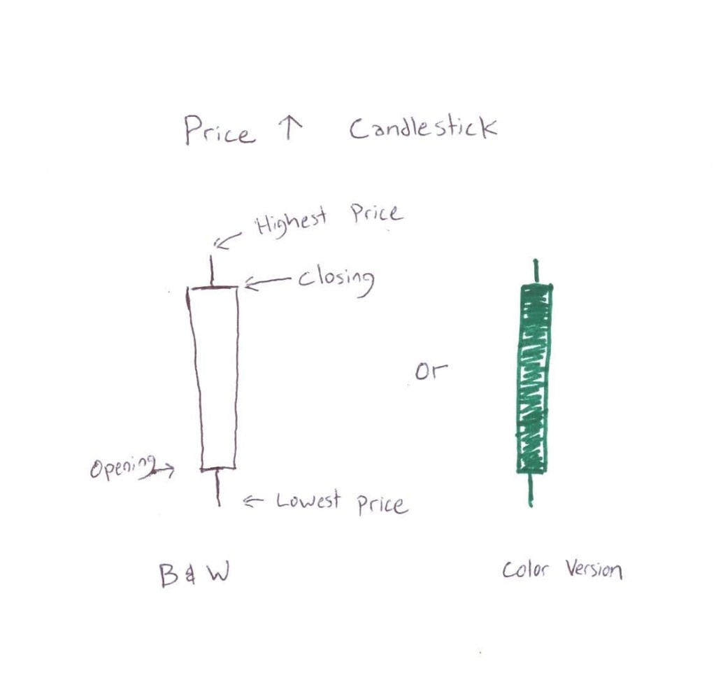
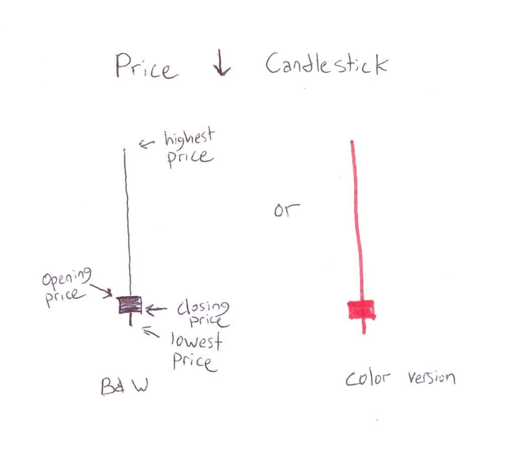
A candlestick pattern is a simply a visual reflection of an asset’s price during a time frame of your choosing. Instead of showing only the closing price, such as what you would see in a line chart, candlestick charts give you more information in a condensed form. Candlesticks can be applied to any time frame. The time frame can vary according to your investment time horizon. If you are looking to scalp options, meaning you want to be in and out of a trade in less than 15 minutes, you might look at one minute time frame candlesticks. If you want to buy and hold a stock for a decade, you may decide to look at weekly, monthly, or even yearly time frames. Candlestick charts are simply a quick visual representation of where the asset started, how low and how high it went, and where it ultimately landed when the time frame ended. One candlestick alone isn’t typically enough information to make a well informed investment decision. You rely on multiple candlesticks to be presented in chronological order (known as a candlestick chart) in order to see a more fleshed out picture of the price action of an asset. However, we need to crawl before we can walk and walk before before we can run, so here is the quick down and dirty of how to read a single candle stick.
Bodies and Wicks
Candlesticks are comprised of bodies and wicks. The body is a box that represents the range between the opening price (the price when the time frame starts) and the closing price (the price when the time frame ends). The wicks, represent the extreme prices for the day. The upper wicks on top of the body represents the highest price the asset went to during that time frame. The lower wick is on the bottom of the body and represents the lowest price the asset went to during the time frame.

It is as simple as that in interpreting a candlestick chart, with a few nuances between assets that closed higher than they started and ones that closed lower than when they started. Assets that close higher than they started will either have a green body or a hollow body if being analyzed in a black and white chart. Assets that close lower than they started will have a red body or solid body if black and white. It’s that easy!
These four data points are now displayed in an easily digestible format. I know I can speak to my knuckle dragging firefighter friends out there who prefer picture books to novels, the candlestick patterns represent what buyers and sellers in any given market think a fair price is during the course of that given time frame. In subsequent articles, we will go into interpreting what different candlestick shapes could possibly mean and how we can position ourselves in a trade or investment…this is just the basics. Remember MAGGOT! Crawl before you walk. Walk before you run!
Back To The Grinder
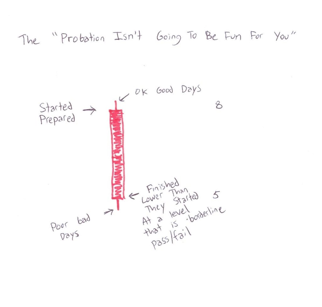
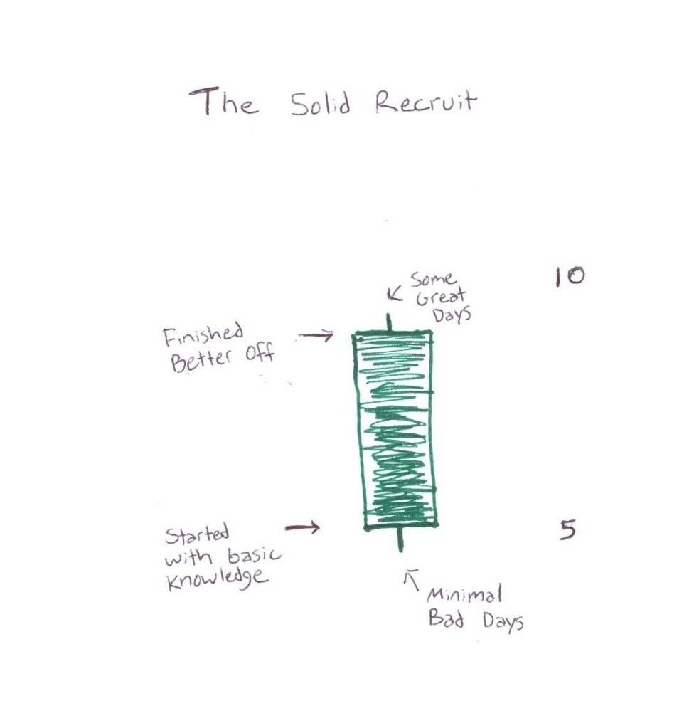
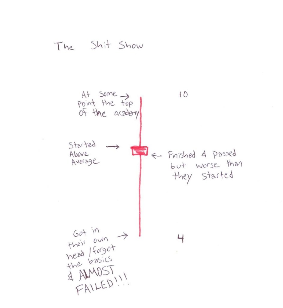
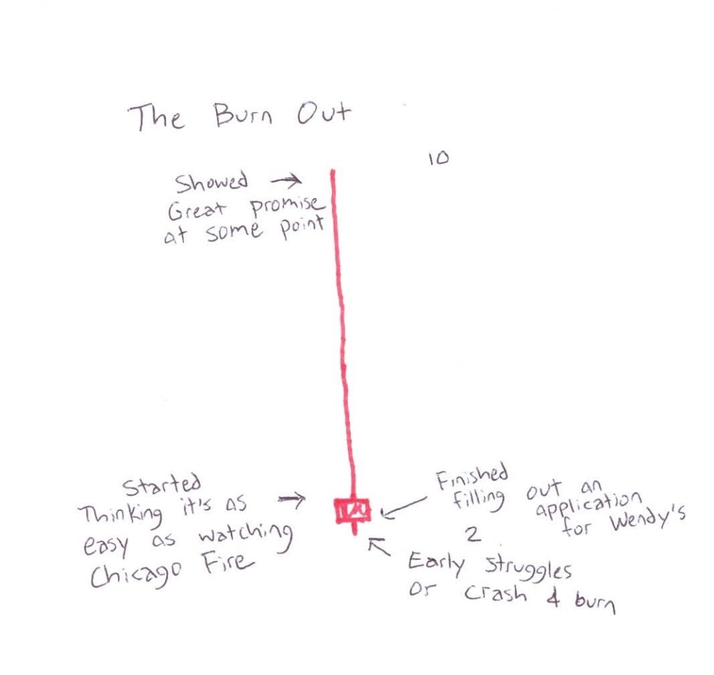
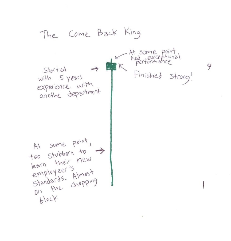
The grinder is the 16 weeks of learning how to become a firefighter. You are a MAGGOT! You are lower than dog shit, and you have few jobs to do other than shut your mouth and learn your trade. Over the course of those grueling 16 weeks, your overall skill level waxes and wanes. The good recruits start strong and finish stronger. I thought this would be a good example to show what candle stick patterns would look like for some of our recruit stereotypes. Say in theory, you could rate a recruit’s performance on a scale of 1-10, 10 being outstanding and anything below 2-3 meaning this job isn’t for you. The rating scale doesn’t change across the time frame of the academy. We are going to analyze some recruit performance candlesticks.
We’ll start with my experience. Recall, I started prepared…probably your average recruit. I got knocked back by illness and my performance plummeted. I thought I was going to fail the academy. One of the instructors had mercy on me one day and pulled me aside. He saw that I was stuck in my own head and he pulled me out of what could be a fatal tailspin. He told me “You’re gonna be ok kid! Keep at it.” He was right. Sure, I struggled a lot. I had good days and off days, but ultimately I demonstrated that I finished stronger than I started. Here’s my candlestick.

That was my story….Here are a few other examples of other recruits we see out there on the grinder today.
Limitations Of Candlesticks
Candlesticks are incredibly powerful tools that we can use to forecast where an asset price id likely to go. However, they have their limitations. First off, they have a lot of noise to them that may distract from the true fundamental attributes of the asset in question. For instance, when 9/11 occurred, you might see a solid company show a loooooooong wick downward. Every company had a long wick down as the whole economy took a beating. Candlesticks also don’t tell the full story of what is going on. To get a more accurate picture, you will have to switch to a shorter time frame and read multiple candlesticks to see where the overall trend of an asset price is heading. These are subjects for future posts. For now, learn how to read the candlesticks….MAGGOT!
